
This story was originally published in the Feb. 15 issue of Fourth Estate.
The above information is from the Media Metrics website. (Megan Zendek/Fourth Estate)
Mason’s Mercatus Center recently launched a website for numbers-driven reporting. Mercatus fellow Brent Skorup created the website, Media Metrics, which went live Jan. 25.
The site displays information in a straightforward way, focusing on the clarity of the charts to deliver time-oriented information on communication topics like social media ad spending, satellite radio and the effects of deregulation on the TV market. Each chart is easy to read and Skorup provides the context of his research as well as a brief analysis of the findings. He said many of the results counter a fear-mongering mindset in the new media age. Skorup said Media Metrics will bring “nuance, hopefully, to the ‘sky is falling’ [mindset] that happens when companies do a new business model or merge.”
The graph on satellite radio, for instance, reaches back into 2007 when competing companies Sirius Radio and XM were the dominant players. When the two declared they would merge into a larger corporation, Skorup said there was a “firestorm” of opposition to the perception of a monopoly.
“The FCC [Federal Communications Commission] ultimately decided to let the merger go through, and I think the company has added 10 million subscribers since then, but I don’t think most consumers today would say this is a radio monopoly,” Skorup said.
Though the companies saw an increase in subscribers following the merger, Media Metrics notes an undramatic increase in overall business. For Skorup, the fear of a digital media monopoly was unfounded.
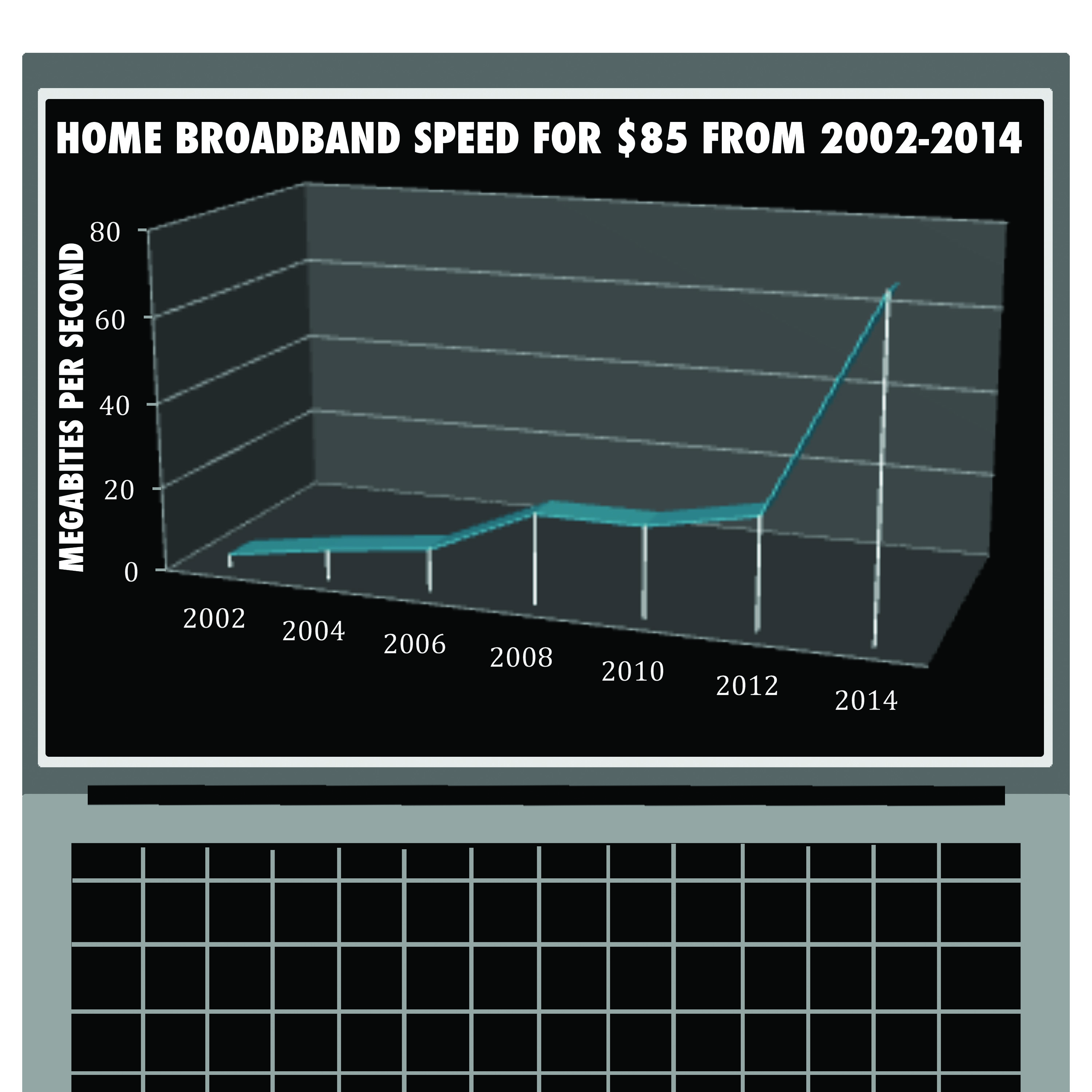
In another recent post,“What Internet ‘Speed’ Does $85 per Month Buy?”, Media Metrics charted internet performance by year, per dollar. Skorup wrote that the advocates of internet regulation operate on “a belief that Internet service providers keep consumer prices high and broadband speeds low and invest in their networks only when absolutely necessary.”
In the Media Metrics chart, broadband speeds have risen tremendously over time, and the quality adjusted terms, meaning dollars to megabits, are growing. That is the key to what Media Metrics offers, not just raw data or of-the-minute opinion, but long-term studies with quality and inflation adjusted numbers that paint a clear picture to compare then and now.
Media Metrics first began in 2008, as a 98-page report written by Skorup’s colleague Adam Thierer along with Grant Eskelsen and published by the Progress & Freedom Foundation. Thierer’s “Media Metrics” was the precursor to Skorup’s site in that it set out to counter a narrative that the media landscape is getting worse. Skorup and Thierer worked together on several academic publications on cronyism in the IT sector and TV regulation, the latter of which is explored on the website.
Thierer’s “Media Metrics” focused on deregulation in communication industries.
“There’s a lot of dynamic things going on in communications technology and media and it helps to look at the data for these things because people have a snapshot view of what’s going on — they know what’s going on today, and we all have short memories,” Skorup said.
After talking with Thierer about his publication, Skorup thought about how much had changed between 2008 and now. For example, Twitter usage was growing as was the overall influence of social media. So, he asked Thierer for permission to use the name and ideas Thierer had developed and built them into a website.
Skorup intends for Media Metrics to capture the attention of the everyday news reader, but he is just as interested in providing accurate information to key members in academia.
“I’ve had some media law professors and media professors Tweet about it and say they plan to use it in class, which is nice,” Skorup said.
Acquiring data sets can be a difficult process. Most of the numbers come from government agencies, especially the Bureau of Labor Statistics (BLS). This has created a few problems for Skorup and his team. For example, according to Skorup, while the BLS does adjust dollars for inflation, the agency does not always adjust for quality. Also, the sheer amount of data required for some charts can pose some problems; Media Metrics went through ten years of data from Comcast in order to build the broadband chart on the website.
“People seem to like that chart,” Skorup said. “That one I think had [the] most retweeting because it is dramatic; it is a big swoop.”
That chart also addresses another group of people that Skorup is trying to reach: “regulators and policymakers and tech [reporters].”
Skorup has a small staff that helps maintain the website and collects data for the charts. Joe Kane is one staff member who analyzes the data findings in the context of policy discussions. Kane is also a Mercatus research fellow pursuing his master’s in economics. He said the data on Media Metrics supports the tenants of a free market.
“These trends should make one think twice before advocating the imposition of onerous regulations that will negatively affect competition, prices and consumer choice,” Kane said via email. “Long term trends reveal that the industry is a pro-consumer environment that over time provides falling prices with rising quality and choice.”
As for the future of Media Metrics, Skorup expects to keep moving toward discovering data sets to chart and analyze. He would like to make the base Excel sheets available to fellow academics and others.
“Our biggest constraint is finding good data,” Skorup said. “A lot of it is locked up behind paywalls, and you need expensive subscriptions for a lot of this.”
For now, Skorup is just trying to drum up interest.
“I hope people will interact with [the website] and give us ideas for what to cover next,” he said.